White vs Silver: which base is right for your photo?
Every metal print starts from a white or silver base, and the one you pick changes how your image feels. Here's how to choose in under a minute.
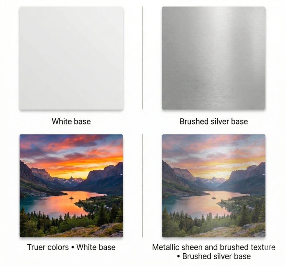
Choose White for true-to-life color — portraits, products, bright and airy photos.
Choose Silver when you want metallic shine in the highlights — sunsets, water, neon, chrome, and high-contrast art.
Sublimation printing dyes your image directly into a coated aluminum sheet. Because the dye is semi-translucent, the base color underneath shows through the lighter parts of your image — so the base isn't a border, it's part of the picture.
How they differ
When to choose White
White is the safe, accurate choice and the right call for most photos. If your image has people, food, products, or any whites you want to stay white (a wedding dress, snow, a bright sky), go White. It's also the better base for soft, pastel, or low-contrast images that could otherwise look muddy.
When to choose Silver
Silver shines — literally — in the bright parts of an image while leaving the dark areas rich. That makes it stunning for sunsets, cityscapes at night, water and reflections, neon signage, chrome, and bold graphic or sci-fi art. Skip it for portraits where accurate skin tone matters, since silver adds warmth.
Toggle between White and Silver right in the designer — the live preview updates instantly so you can see the sheen before you commit. Still torn? Add a free human proof at checkout and we'll tell you which we'd print.
Ready to make something?
Upload your photo or art, preview it on the real product, and approve a free proof before anything prints.